Decoralot is reader-supported. When you buy through links on our site, we may earn a commission at no cost to you — and it never influences our picks. See how we choose.
Walk into a room that feels expensive and you'll usually credit the furniture. Look closer and it's the color doing half the work — and color, unlike furniture, costs the same whether you choose it brilliantly or badly. A gallon of the right shade is the single cheapest luxury upgrade in the home. What makes a color read as expensive isn't the color itself; it's three properties designers select for instinctively. First, complexity: costly-looking shades are mixed from many pigments, so they shift subtly through the day instead of sitting flat. Second, muted saturation: a dusty, grayed, or earthen version of a color always outranks its crayon-bright sibling. Third, warmth in the undertone, even in the cool shades — sterile blue-whites and mall grays are how rooms end up feeling like rentals. Hold any color against those three tests and you can predict how it will behave. Here are the nine that pass most reliably, and how to use each.1. Greige — the Foundation That Can't Miss
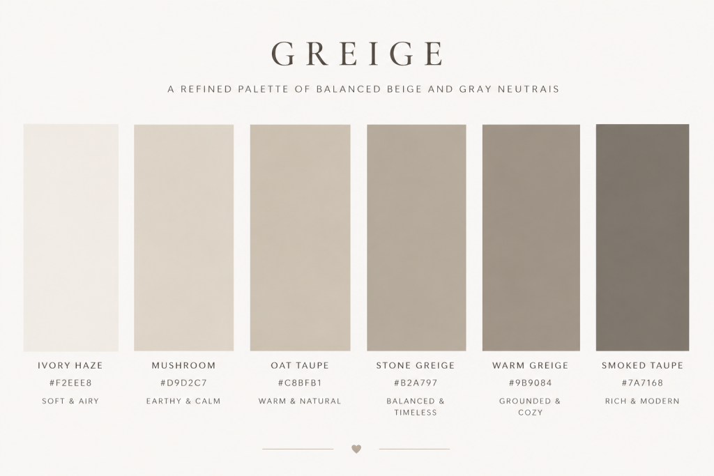
The gray-beige hybrid earned its ubiquity honestly: it carries gray's modernity and beige's warmth, flatters every wood tone, and forgives every lighting condition. As a whole-room envelope it produces instant calm; the luxury move is pairing it tonally — greige walls, oatmeal sofa, ivory trim — rather than using it as a backdrop for contrast.
2. Warm White — but Never Builder's White
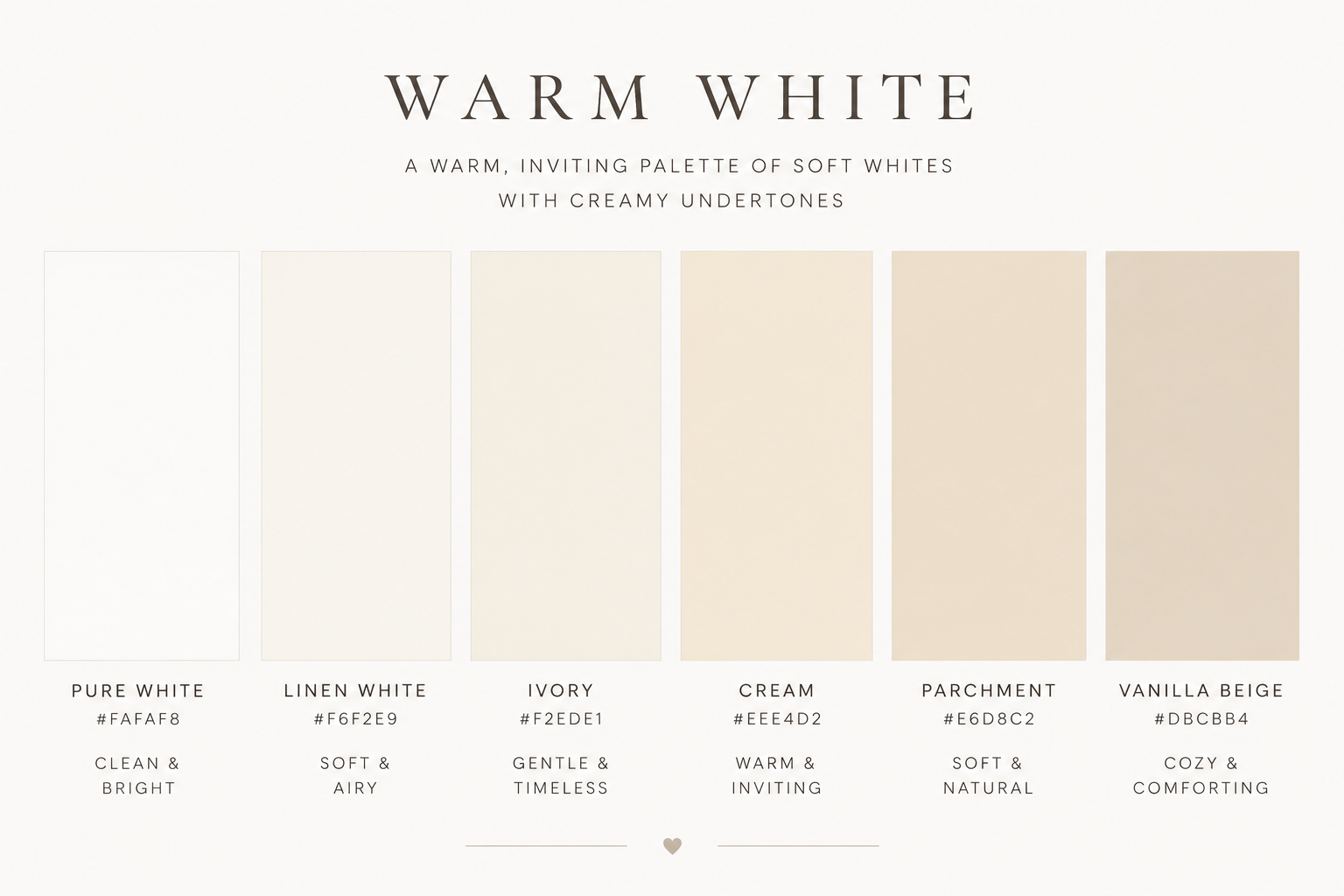
The difference between a gallery and a rental is undertone. Expensive whites are creamy, complex, faintly warm — they make light look like late afternoon. Stark blue-whites flatten everything they touch, including the furniture you paid for. Test your white against a sheet of printer paper: if they match, keep looking.
3. Charcoal — the Confident Dark
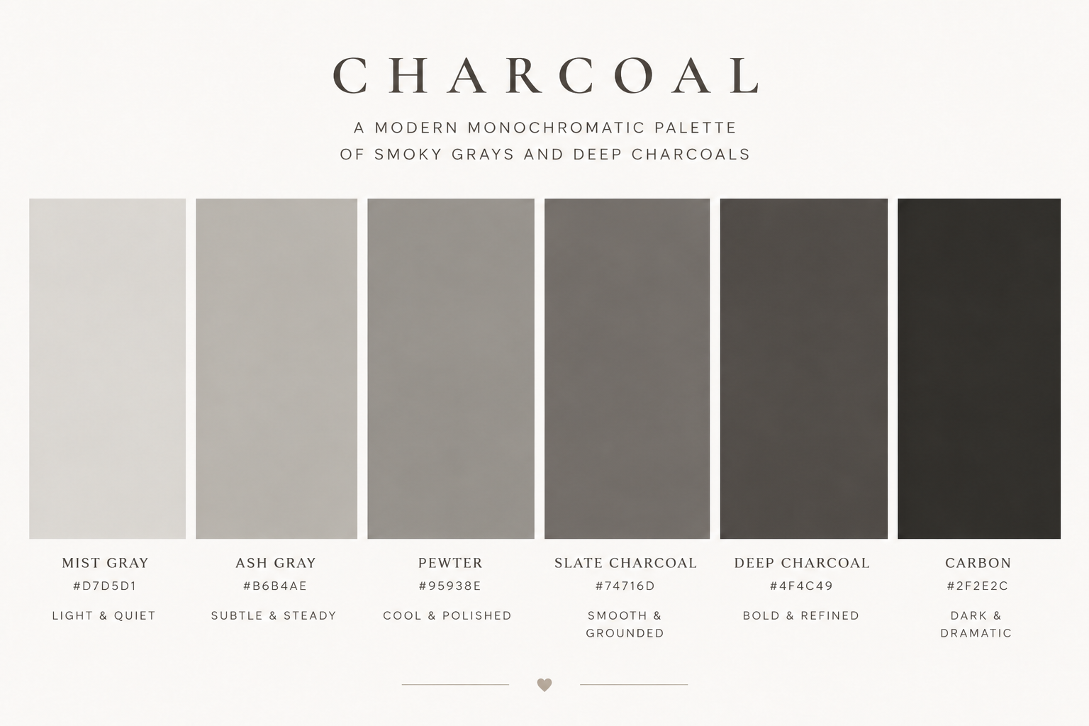
Deep, soft near-black on walls, cabinetry, or a statement wall reads as conviction, and conviction reads as money. Charcoal also does the practical work of making art, brass, and pale upholstery glow against it. Use it in rooms with decent natural light, or lean in fully and make a moody library of a dim one.
4. Olive & Sage Green — the Moment That's Earning Permanence

The grayed greens are the rare trend with classical bones — they behave like neutrals while reading as a choice. Olive brings depth and works beautifully on cabinetry and walls alike; sage keeps rooms airy. Both pair naturally with the warm-neutral textiles of current luxury interiors.
[LASSO DISPLAY: sage and olive accent décor — pillows, throws, ceramics]
5. Deep Forest Green — the Heritage Power Color
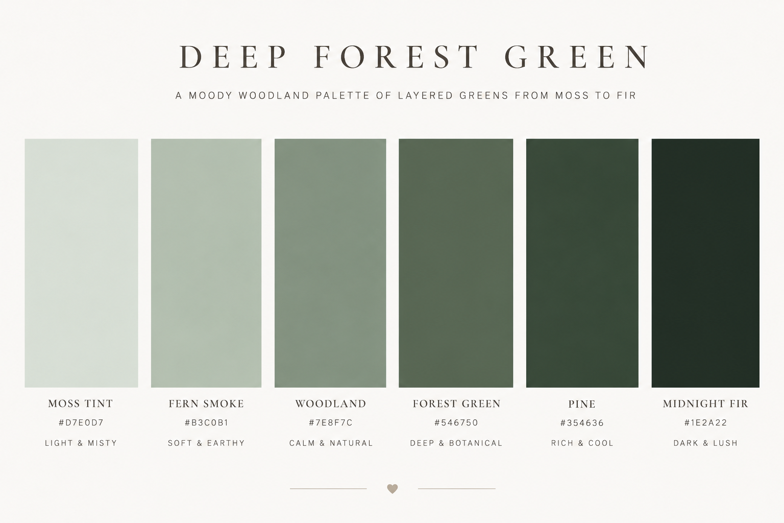
Where olive whispers, forest green speaks in a low, assured voice — the color of old libraries, English country houses, and our own brand palette, not coincidentally. On cabinetry, built-ins, or a dining room it delivers more perceived luxury per gallon than any shade on this list. Brass hardware against it is the classic finishing move.
6. Chocolate & Espresso Brown — the Comeback Aristocrat
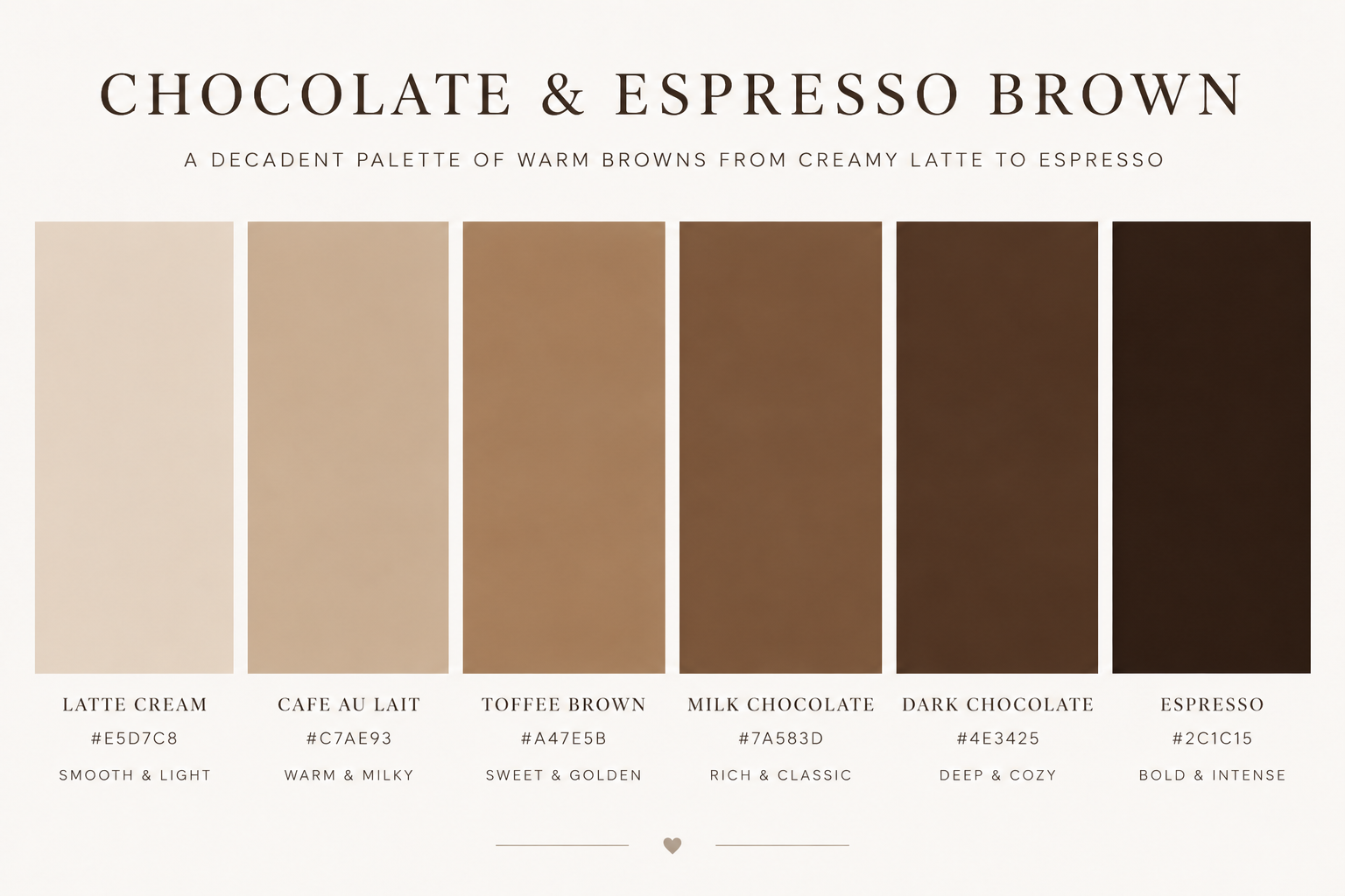
After two decades of gray's reign, deep brown is back in serious rooms — and it photographs like cashmere. Chocolate velvet upholstery, espresso walls in a den, caramel leather: browns ground a space with a warmth gray never managed. Keep the undertone red-to-golden; muddy gray-browns lose the richness.
7. Camel & Caramel — the Wardrobe Theory of Rooms
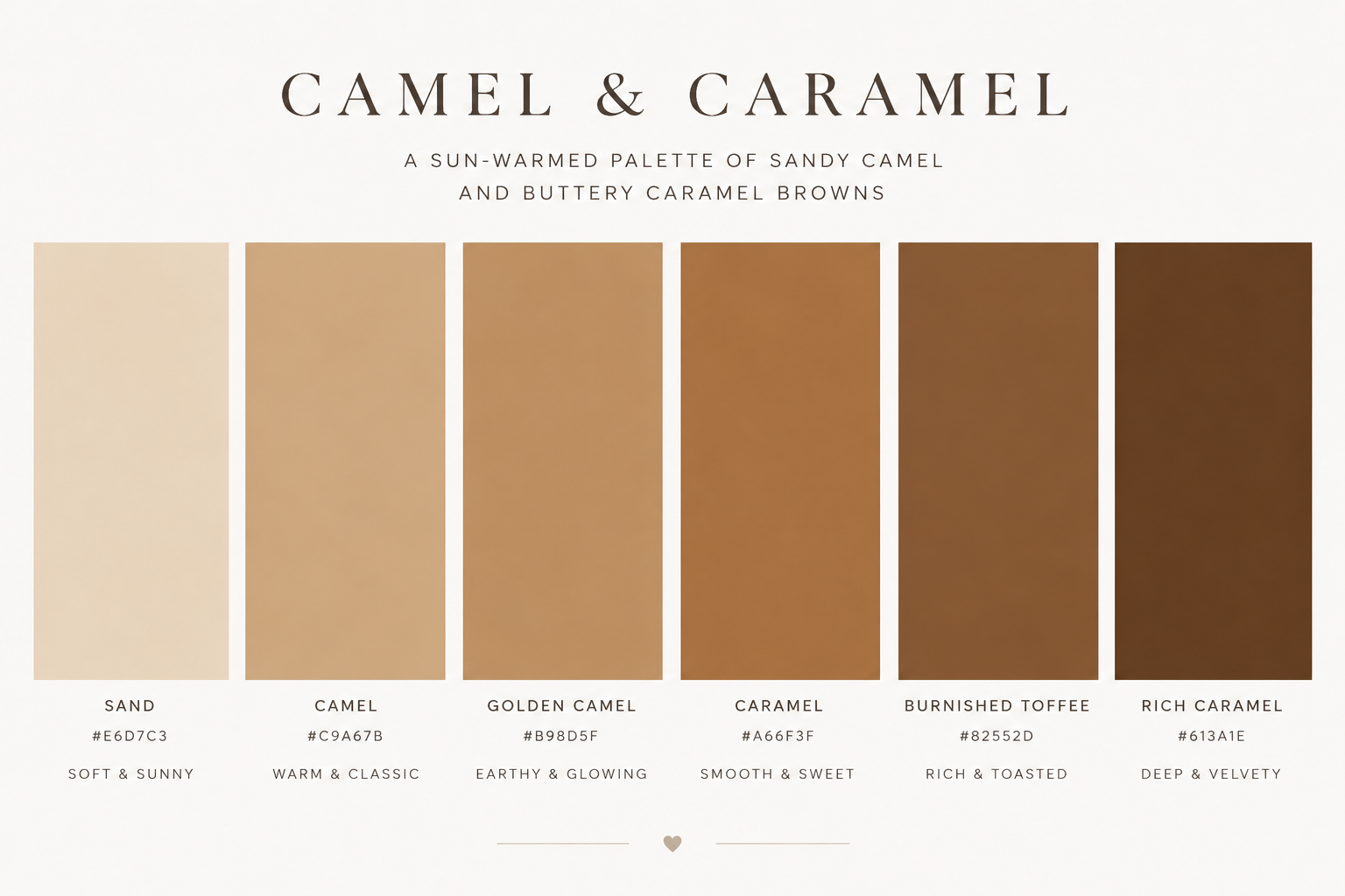
If it works as a coat, it works as a room. Camel — on upholstery, drapery, or walls — carries the same quiet-money signal it carries on Madison Avenue, and it warms every neutral around it. This is the connective shade of the quiet luxury palette we build in our quiet luxury living room guide.
8. Dusty Terracotta & Clay — Earthy, but Grown Up
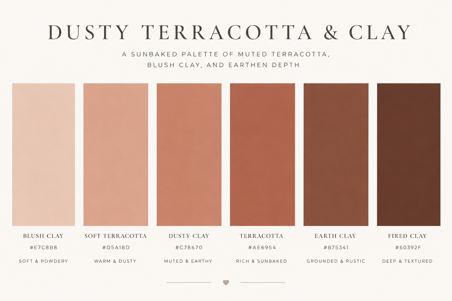
The muted, browned versions of terracotta bring Mediterranean warmth without the theme-park risk of bright orange. Beautiful in plaster-look finishes, on accent walls, and in textiles, clay tones flatter skin in lamplight — an underrated reason dining rooms love them.
9. Inky Navy — the Dependable Deep
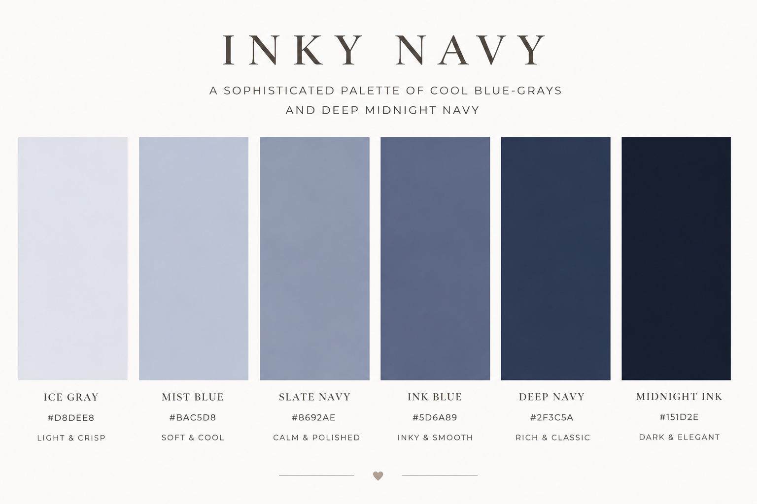
Navy is the dark for rooms where charcoal feels too stern: nearly as dramatic, slightly more forgiving, endlessly compatible with white trim, brass, and warm wood. On a kitchen island or a bedroom wall it is the lowest-risk path to high-impact depth.