9 Colors That Make a Room Look Expensive
9 Colors That Make a Room Look Expensive Read Post »
Color is the foundation every other design decision builds on — and the easiest thing to get wrong. The right palette makes a space feel expensive and calm, but the wrong one makes good furniture look cheap. Below are the designer rules that actually work, including rules for rooms that have you ‘stumped’. These guides cover paint colors, coordinated palettes, and the warm neutrals and moody tones shaping today’s interiors, with practical advice for choosing shades that flatter your light and your furnishings. Build a color story for your home with confidence.
The secret to an expensive-looking palette isn’t which color you pick — it’s the undertone. Warm-gray “greige,” soft clay, muted sage, and deep ink read as considered because their undertones are complex rather than primary. Flat, saturated builder colors read as cheap. The same is true for whites: a white with a warm undertone flatters a room; a stark cool white can feel clinical.
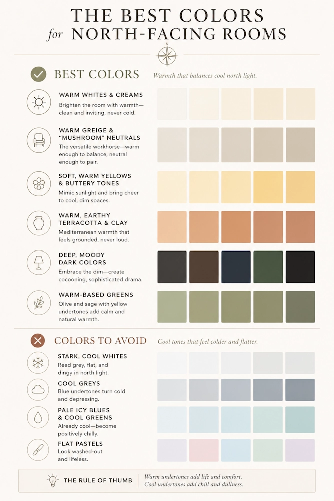
A color is only as good as the light it lives in. North-facing rooms get cool, flat daylight that turns grays blue and whites gray — so they need warmer undertones to compensate. South-facing rooms can take cooler, moodier colors that would feel grim elsewhere. Always test a large sample on the actual wall, at different times of day, before committing.
Learn the rules in colors that make a room look expensive, then solve difficult daylight with our north-facing room guide. To see a restrained palette in practice, our quiet luxury living room ideas show how far a tight, tonal scheme can carry a space.