
Decoralot is reader-supported. When you buy through links on our site, we may earn a commission at no cost to you — and it never influences our picks. See how we choose.
The console table is one of the most visible surfaces in a home and one of the most commonly mis-styled. In an entryway it's the very first thing guests see; behind a sofa or along a hallway it's a constant focal point at eye level. Yet, most consoles end up either bare and forgotten, or cluttered with keys and mail. The good news is that designers style consoles using a simple, repeatable formula. Once you understand the layering logic, you can make any console look intentional and expensive in ten minutes. Here's exactly how.
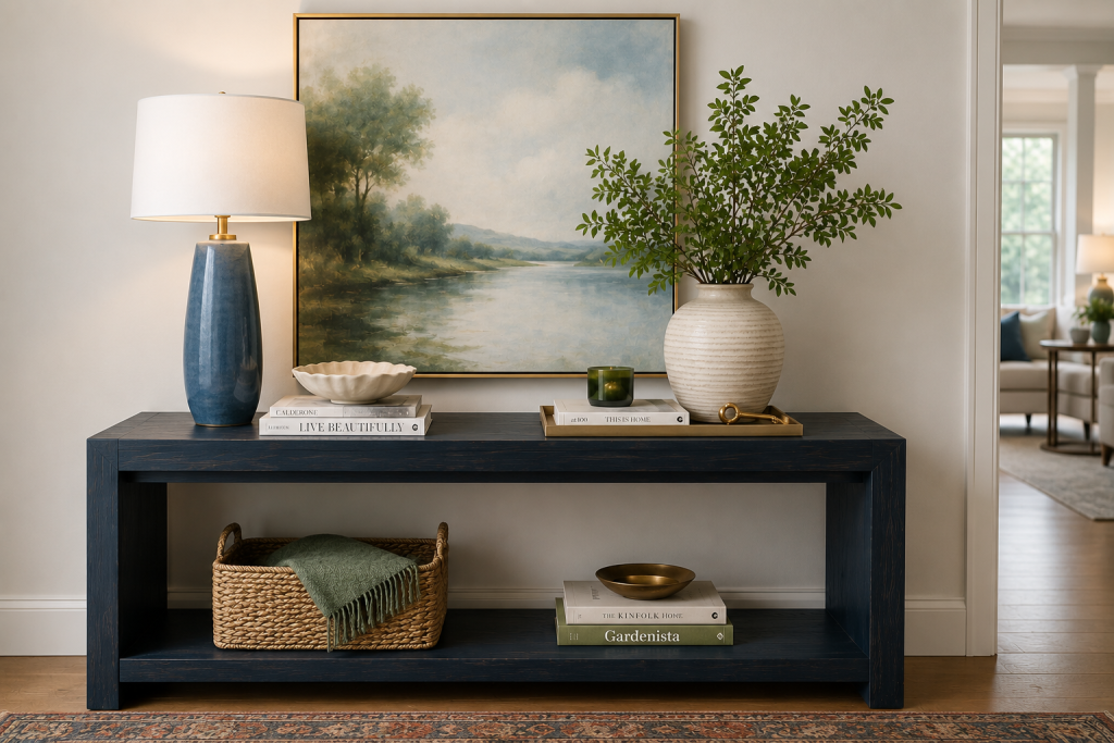
What to Put on a Console Table
First, determine what you want to put on your console table. Here is the reliable toolkit to mix and match:
- a lamp or pair of lamps
- a piece of art or a mirror above
- a stack of two or three coffee-table books
- a sculptural object or bowl
- a vase with fresh or dried stems
- a decorative tray to organize the small stuff
- a candle or two
- a touch of life from greenery or flowers
You don't need all of it — pick three to five pieces that vary in height and texture, and let the empty space do the rest.
The Designer Formula, in Brief
Every well-styled console follows the same three-part structure: something tall at the back (anchor), something layered in the middle (the vignette), and something low and grounding in front. You build vertically against the wall and forward toward the room, working in odd-numbered groupings, varying heights and textures, and — crucially — leaving deliberate empty space. That's the whole method. Everything below is detail.
Step 1: Anchor the Back with Height
Start with the vertical element that grounds the whole arrangement. The classic move is art or a mirror above the console. Place a large piece or a leaned, oversized frame that fills roughly two-thirds the width of the table. If wall art isn't an option, create height on the surface itself with a tall lamp or a pair of lamps, a large vase with branches, or a stack of books topped with a sculptural object. This back layer sets the scale and stops the console from looking flat.
Step 2: Build the Middle Vignette
This is where the styling happens. Work in groupings of three, mixing heights and shapes: a stack of coffee-table books laid flat, a sculptural object or bowl on top, a vase with fresh stems or a piece of greenery. Vary the textures. Place something smooth, something organic, and something with a little shine, and keep a loose color story of two or three tones. The trick designers swear by is the triangle: arrange objects so your eye travels in a triangle across varied heights rather than a flat line.
Step 3: Ground the Front and Edit
Add one low, horizontal element to anchor the front and create depth toward the room. You can use a tray to corral smaller objects, a low bowl, a decorative box, or a short stack of books. Then comes the most important step, the one most people skip: edit. Remove a third of what you've placed. Negative space is what separates a designer console from a cluttered one. Step back, look at the whole, and take away anything that doesn't earn its spot. A console should look composed, not full.
Console Styling by Location
Adapt the formula to where the console lives. In an entryway, build in function: a tray for keys, a small lamp on a timer for a warm welcome, a mirror for a last look, and a bowl or dish for daily items; think of beauty that earns its keep. When putting a console table behind a sofa, keep objects lower so they don't block sightlines, and balance the lamp to one side with a vignette to the other. In a hallway, go simpler and more symmetrical. Placing a pair of lamps flanking a central object reads calm and gallery-like in a transitional space.
Common Mistakes to Avoid
Three errors account for most bad consoles. The first error is hanging art too high above the table. Instead, you want to keep the gap to roughly six to eight inches so the art and console read as one composition. The second error is lining objects up in a flat row of similar heights, which looks like a shelf rather than a styled vignette. Instead, vary the heights, and cluster in groups. The third error, and probably the most common one, is overcrowding. When in doubt, remove something. The most expensive-looking consoles are almost always the most edited.
Frequently Asked Questions
What do you put on a console table?
A reliable mix is a lamp or pair of lamps, art or a mirror above, a stack of books, a sculptural object or bowl, a vase with stems, and a tray to organize small items. Choose three to five pieces that vary in height and texture rather than using everything, and leave deliberate empty space.
How high should art hang above a console table?
Keep the gap between the top of the console and the bottom of the art to roughly six to eight inches, so the two read as a single composition. Hanging art too high is one of the most common console-styling mistakes and makes the wall feel disconnected from the table.
How do you style a console table behind a sofa?
Keep objects lower than they'd be in an entryway so they don't block sightlines across the room. Balance the arrangement with a lamp to one side and a vignette of varied heights to the other, and skip a large mirror or tall art unless the sofa floats well away from the wall.
How many items should be on a console table?
Aim for three to five pieces or small groupings, arranged in odd numbers with varied heights, and edit ruthlessly. Negative space is essential — the most polished, expensive-looking consoles are the most restrained, not the most filled.
A well-styled console sets the tone for the whole room. Pair the technique with the right pieces — see the best console tables, the best luxury vases, and the entryway hub for more ways to make a great first impression.